Why is it important to monitor your agents?
As an administrator of the agent platform, it is important that you analyze the performance of sales agents and verify if they are paying due attention to each user. Daily monitoring of agents is key to identifying the volume of chats in their inbox, response time, as well as the duration and periods of inactivity in conversations.Where to find the metrics panel
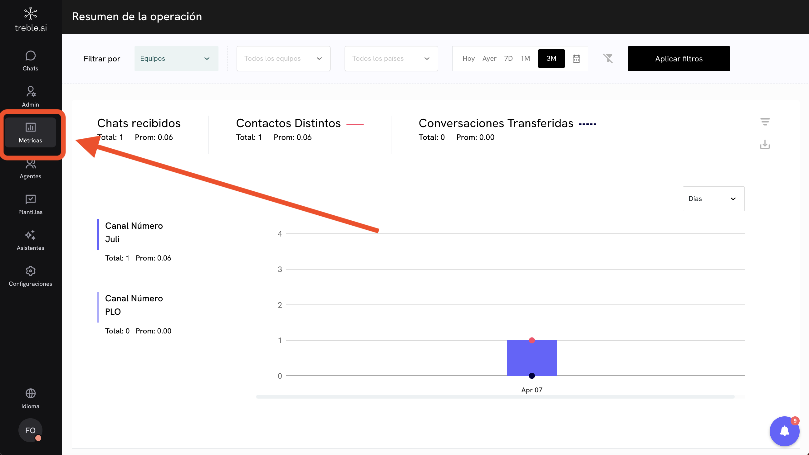
To access the metrics panel, first, log in to yoursales.treble.ai
account and then go to the Metrics section. Remember that to access this section, you must be an administrator of the platform.
Available metrics
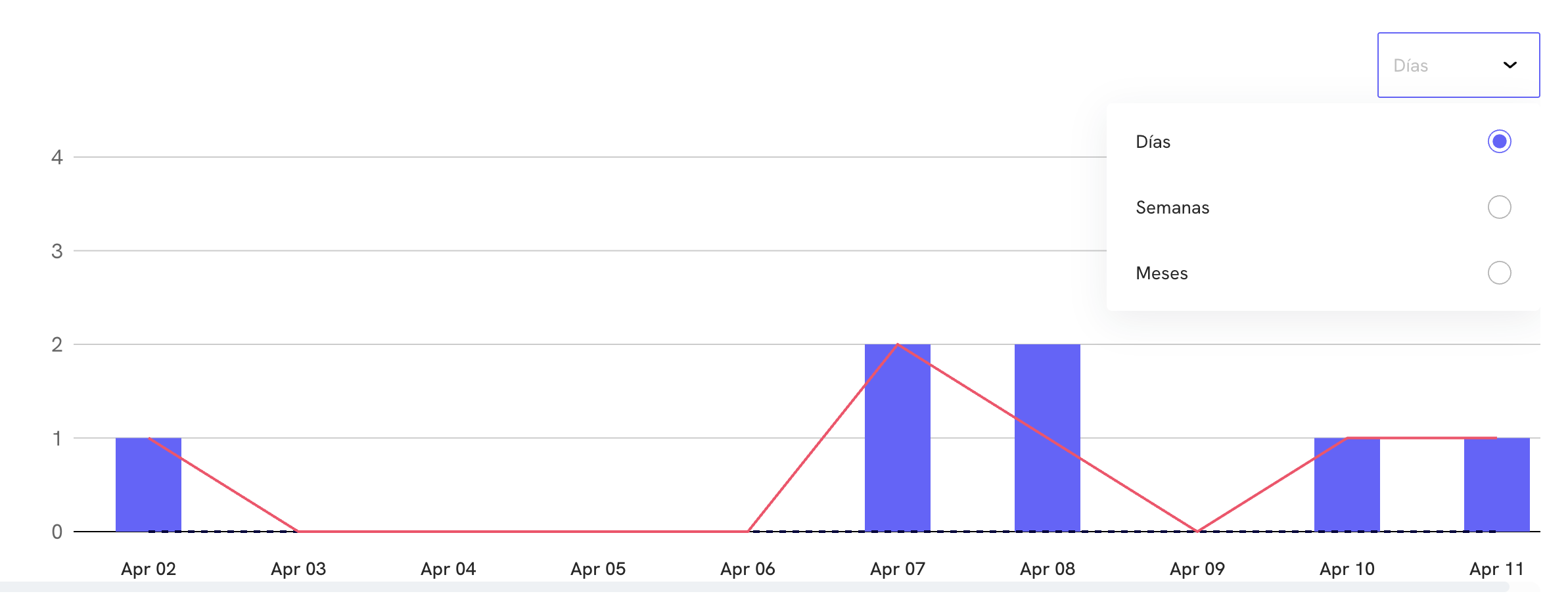
Filters
At the top of the metrics panel, you will find the filters option, an essential tool for adjusting the data visualization according to what you need to analyze.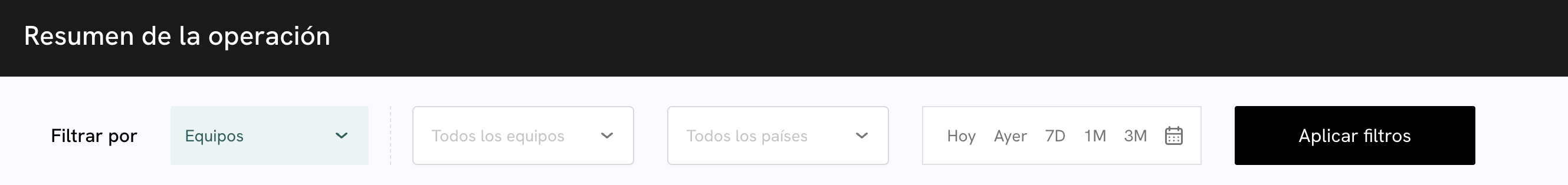
Sales only shows metrics corresponding to the last 90 days (counting from the current day). If you need to access earlier information, you will need to request it directly from the support team.Don’t forget to click on Apply filters to execute your selection
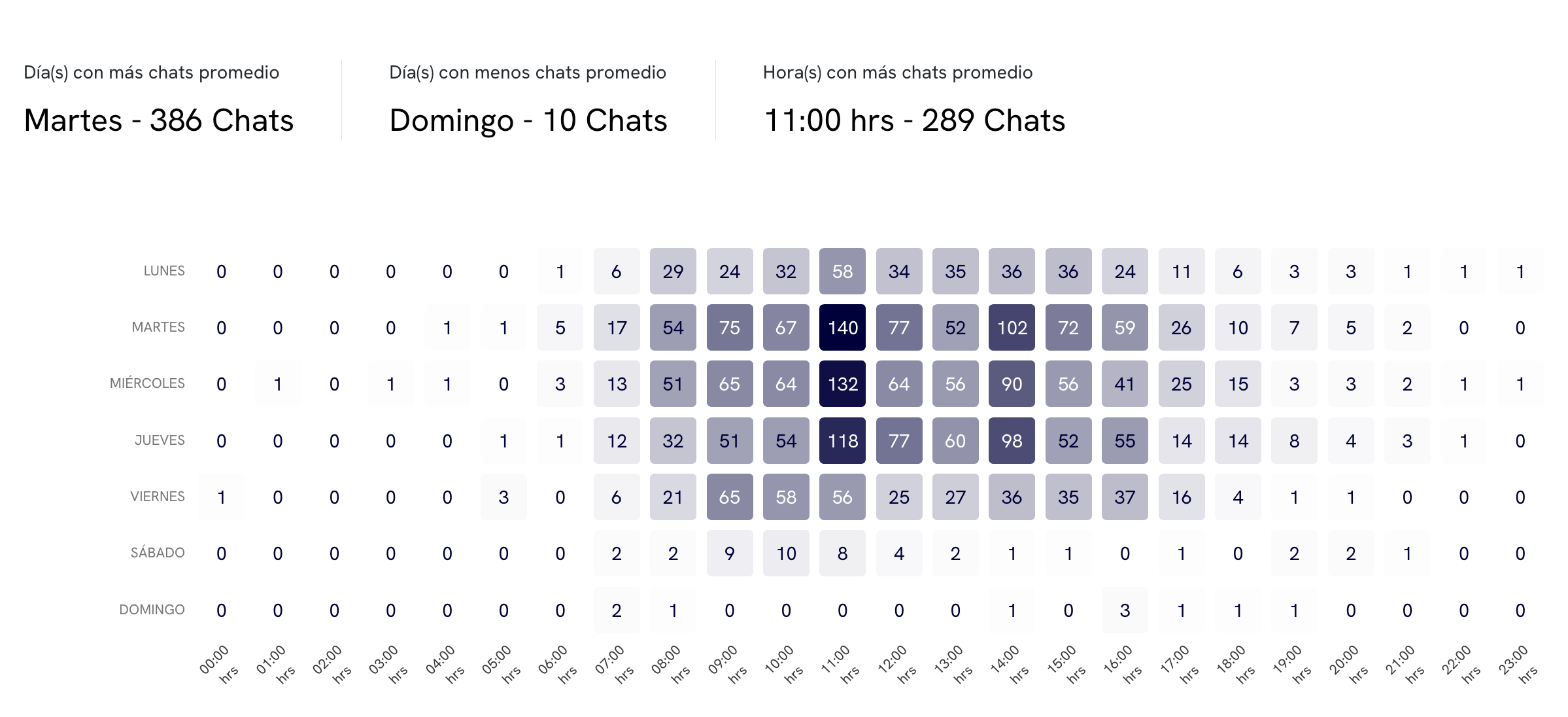
Chat dynamics and volume

- Chats received: represents the total number of conversations that have arrived on the platform, regardless of whether they were answered or not. This data helps you measure the demand you are receiving.
- Distinct contacts: shows you how many unique users have contacted you. It is useful for identifying the real reach of your campaigns or understanding how many new customers you are serving.
- Transferred conversations: indicates how many times a conversation has been transferred between agents. This number can help you detect bottlenecks or training needs within the team.
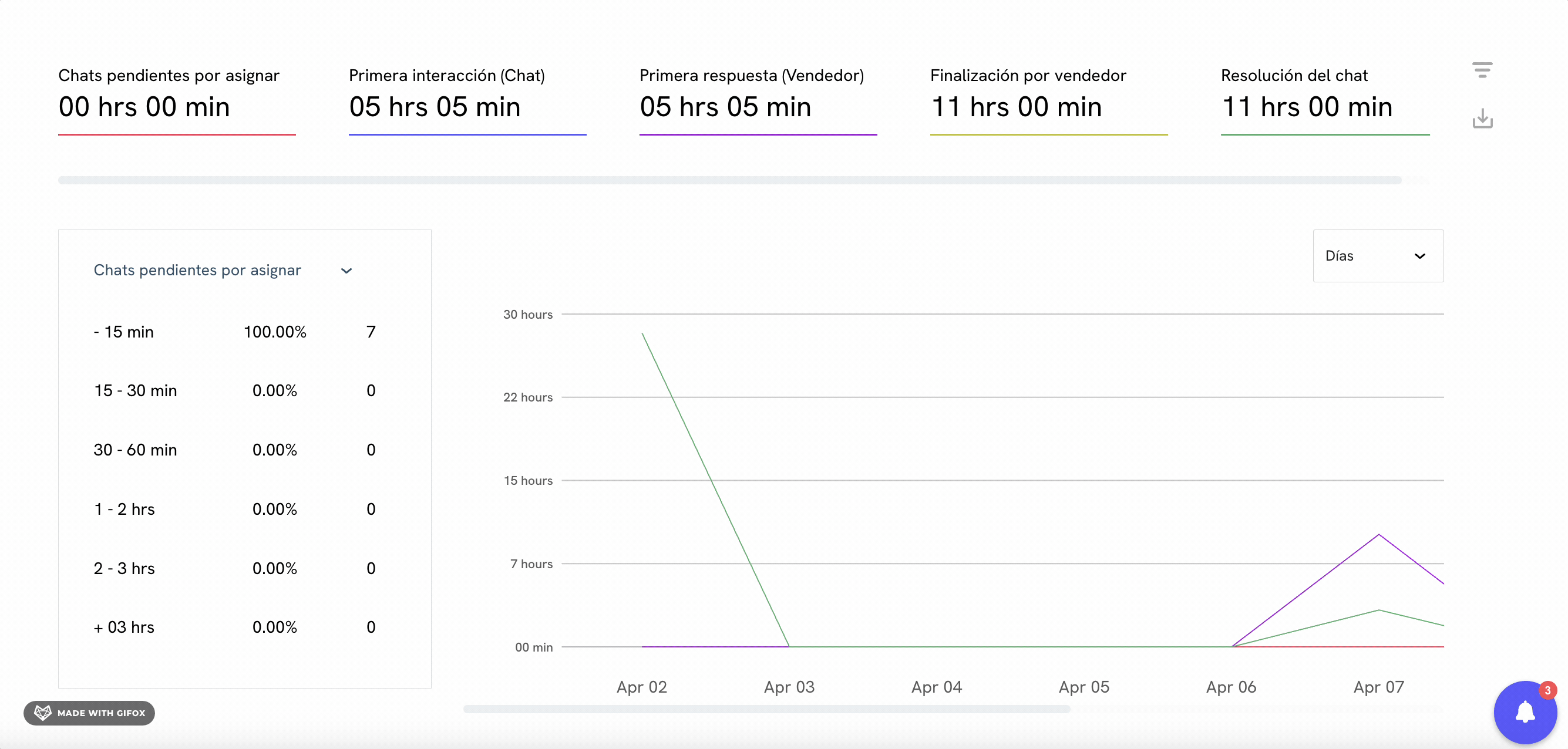
Times
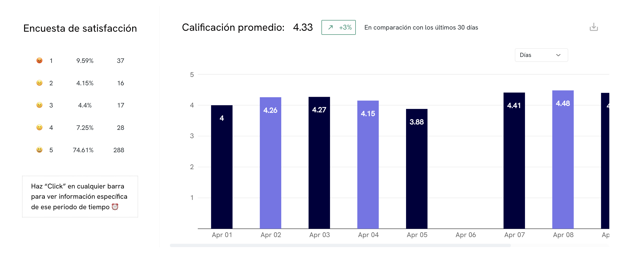
Service rating/satisfaction survey
Interaction Data